
Each piece here is available as an archival print on premium paper. Paintings are limited edition; printmaking and digital works are open edition. Select a size below any piece to go straight to checkout.
Paintings
Original oil, acrylic, gouache, pastel, and graphite works — limited editions of 20–30 prints each on premium archival paper.
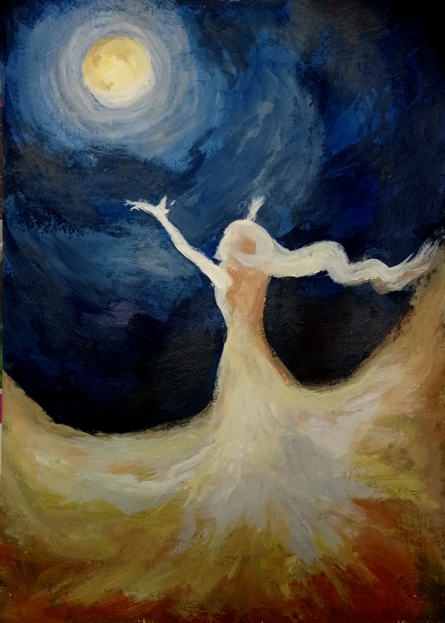
Girl & Moon
Oil on canvas. Moonlit figure, cool lunar blues against warm skin tones. Edition of 25.
Painted during a full moon night after watching The Tale of Princess Kaguya. The girl and the moon mirror each other — one in the sky, one on earth — quietly sharing the same lonely glow. Soft edges, dark blues, and warm highlights meant to feel like a dream you don't want to let go of.
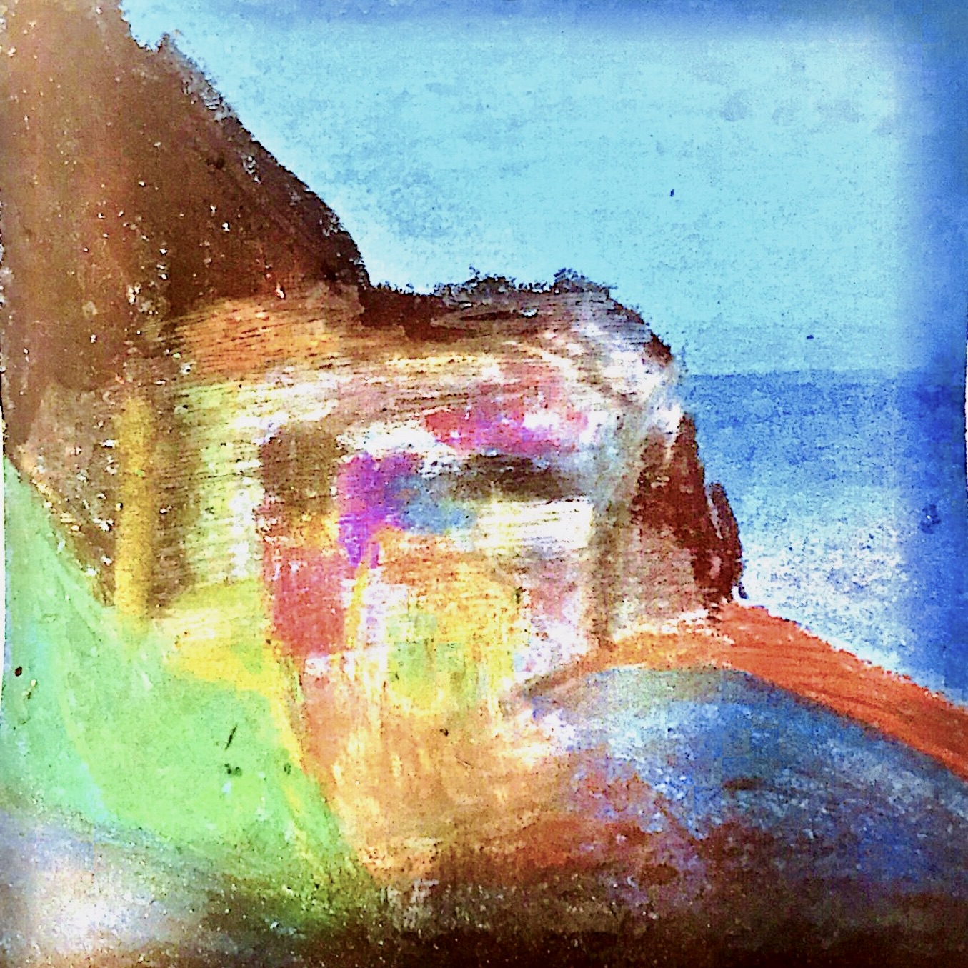
Pastel / #1
Soft pastel on blue watercolor paper. Inspired by Manarola — glowing windows, stacked houses by the water. Edition of 30.
Using a blue base let the lights of the coastal town glow more intensely, almost like they're floating on the water. A place I've never visited in person, but often visit in my imagination — a quiet, dreamy maze of light and shadow.
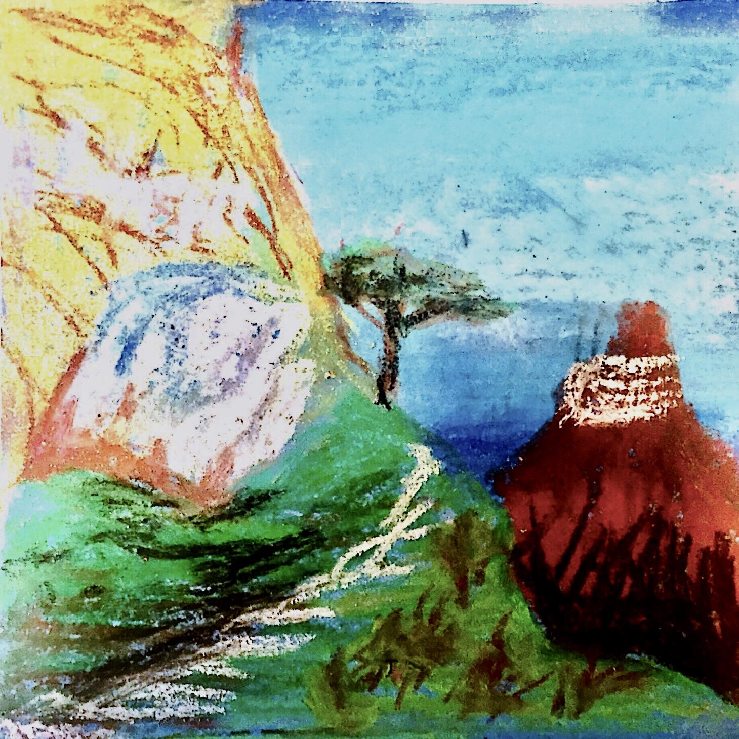
Pastel / #2
Soft pastel on blue watercolor paper. Childhood mountains in soft pastels — the feeling of going home. Edition of 30.
These mountains come from childhood memory more than reality. I wanted the sky to feel wide and the land to feel small, like the world is both familiar and a little overwhelming. A quiet landscape that holds the feeling of going home after a long time away.
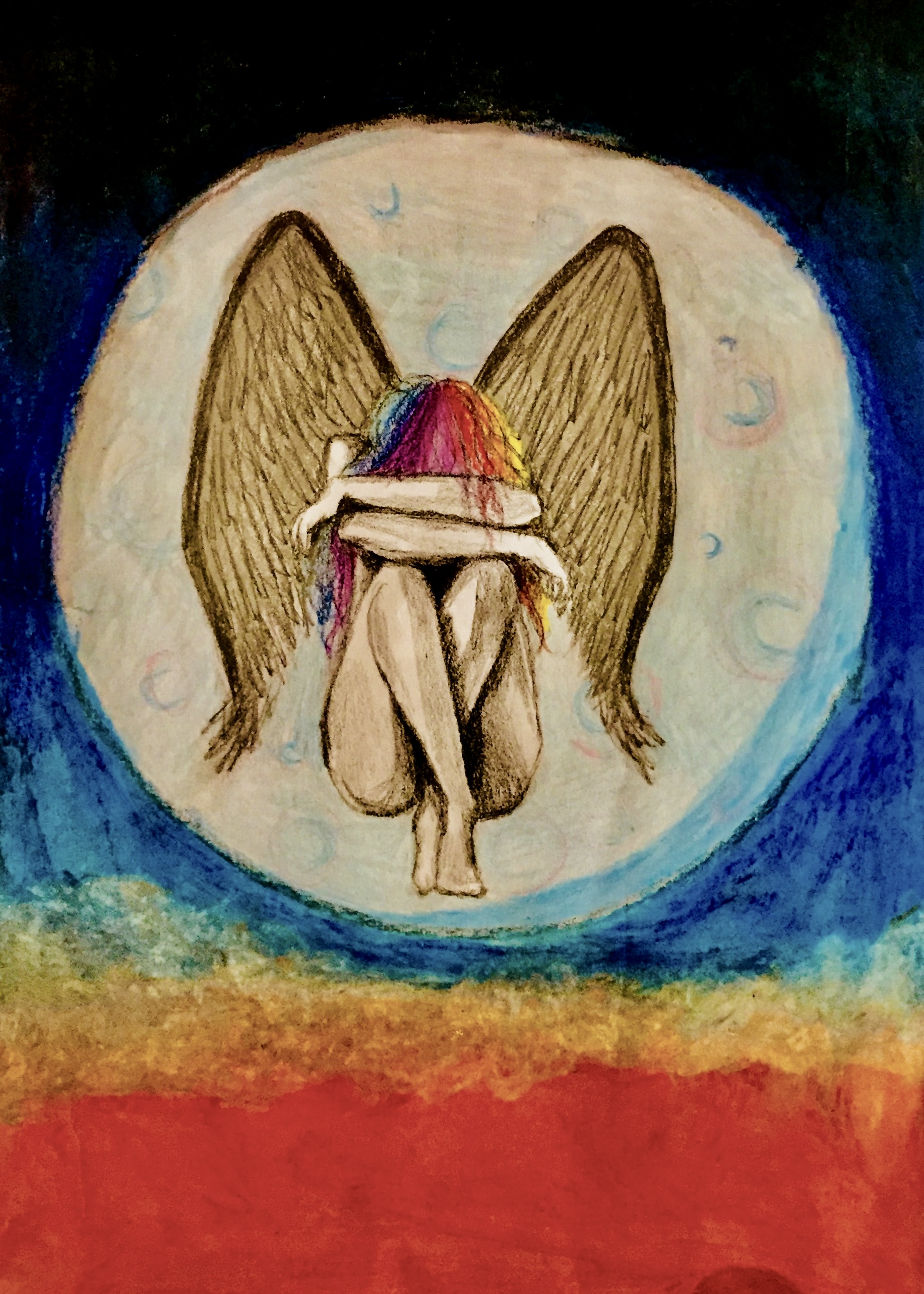
Angel & Moon
Pastel on toned paper. Glowing angel in moonlight — dark pencil sketch with vibrant pastel sky. Edition of 25.
An angel that can only rest when wrapped in moonlight, as if the sky keeps her secrets safe. The glowing halo and soft wing folds create a quiet, weightless moment. Dark pencil sketch against vibrant pastels makes her feel otherworldly.
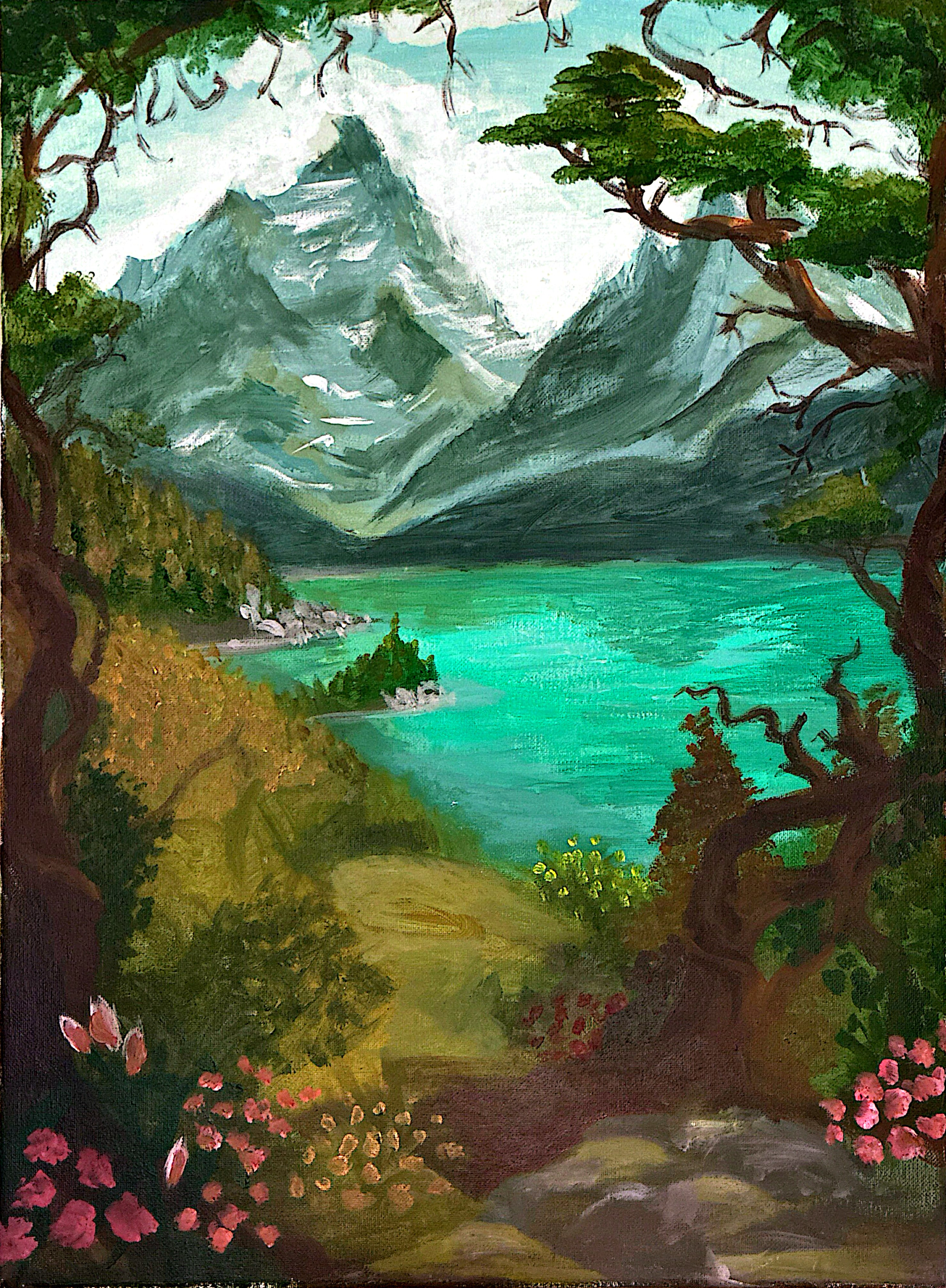
The Hike
Acrylic on canvas. Glacial lake, ancient trees, snow-dusted peaks, pink wildflowers. Edition of 30.
A longing for places that feel untouched. Two trees frame the eye toward the mountain and glowing lake below. Pink wildflowers dot the foreground like sparks of joy — that moment you break through the treeline and everything goes quiet.
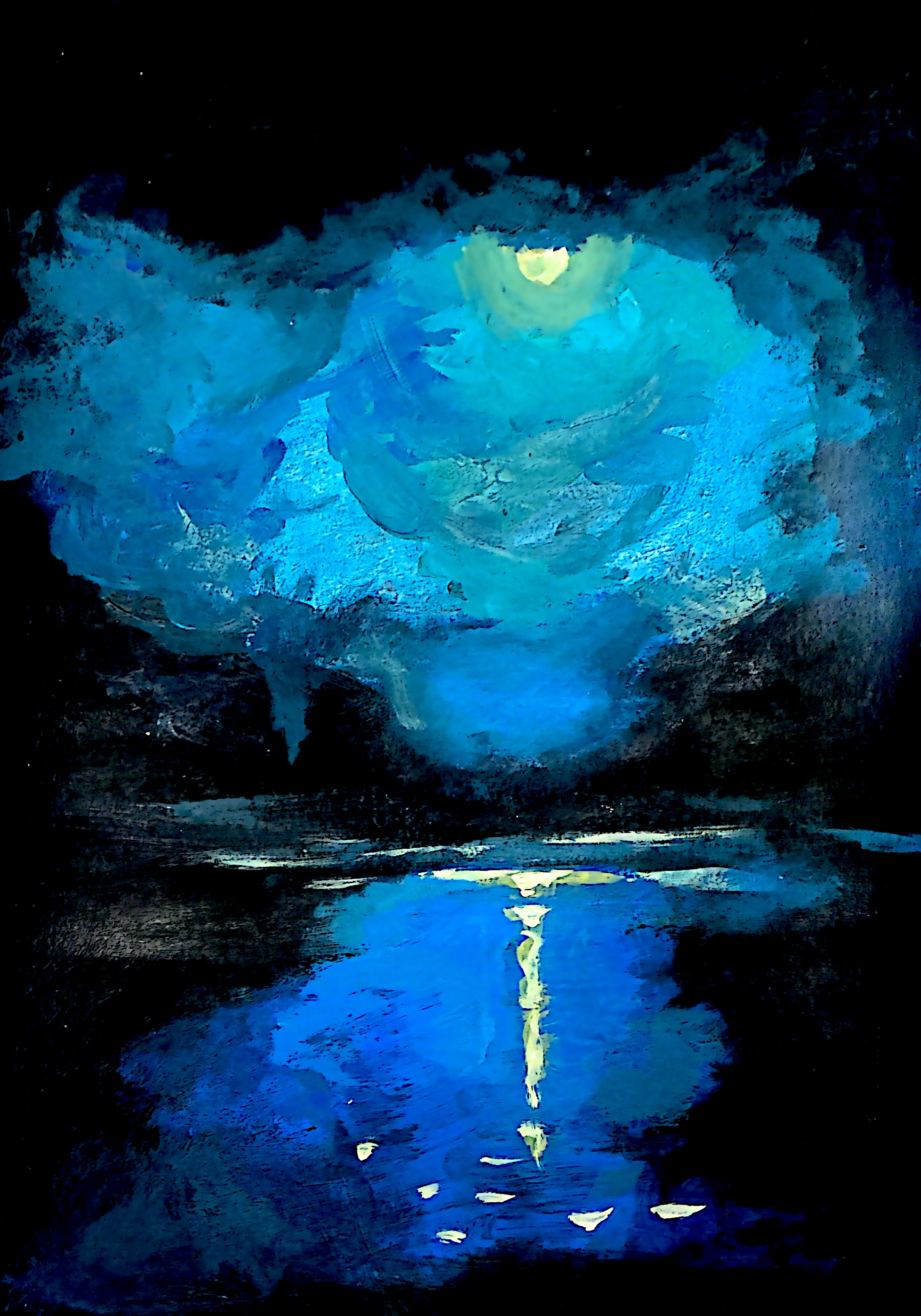
Night Sea
Acrylic. Moonlit sea, luminous cyan sky, a single streak of gold crossing the dark water. Edition of 25.
Standing somewhere dark and vast where the only light is above and its reflection below. The moon reveals more than it illuminates — the sea dark and unknowable except for that single streak of gold. Small bright flecks on the water feel like stars that got tired and fell.
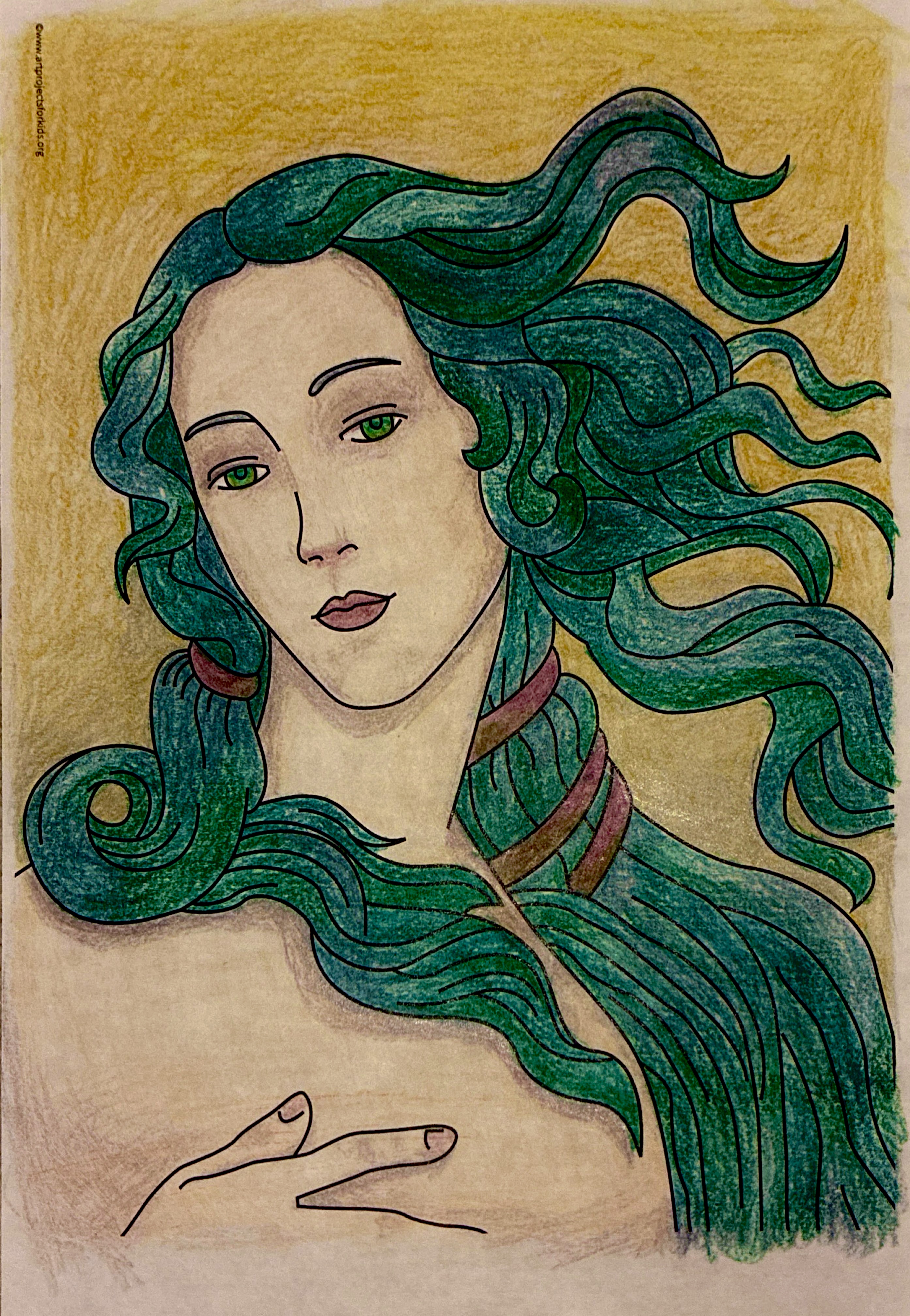
Venus After Botticelli
Colored pencil. Botticelli's Venus reinterpreted with bold outlines and teal-green hair. Edition of 20.
Bold outlines and flat color fields rather than the soft gradients of the original. The teal and deep green hair feels more alive — something between mythological and contemporary. She's still Venus, but she's also her own person now.
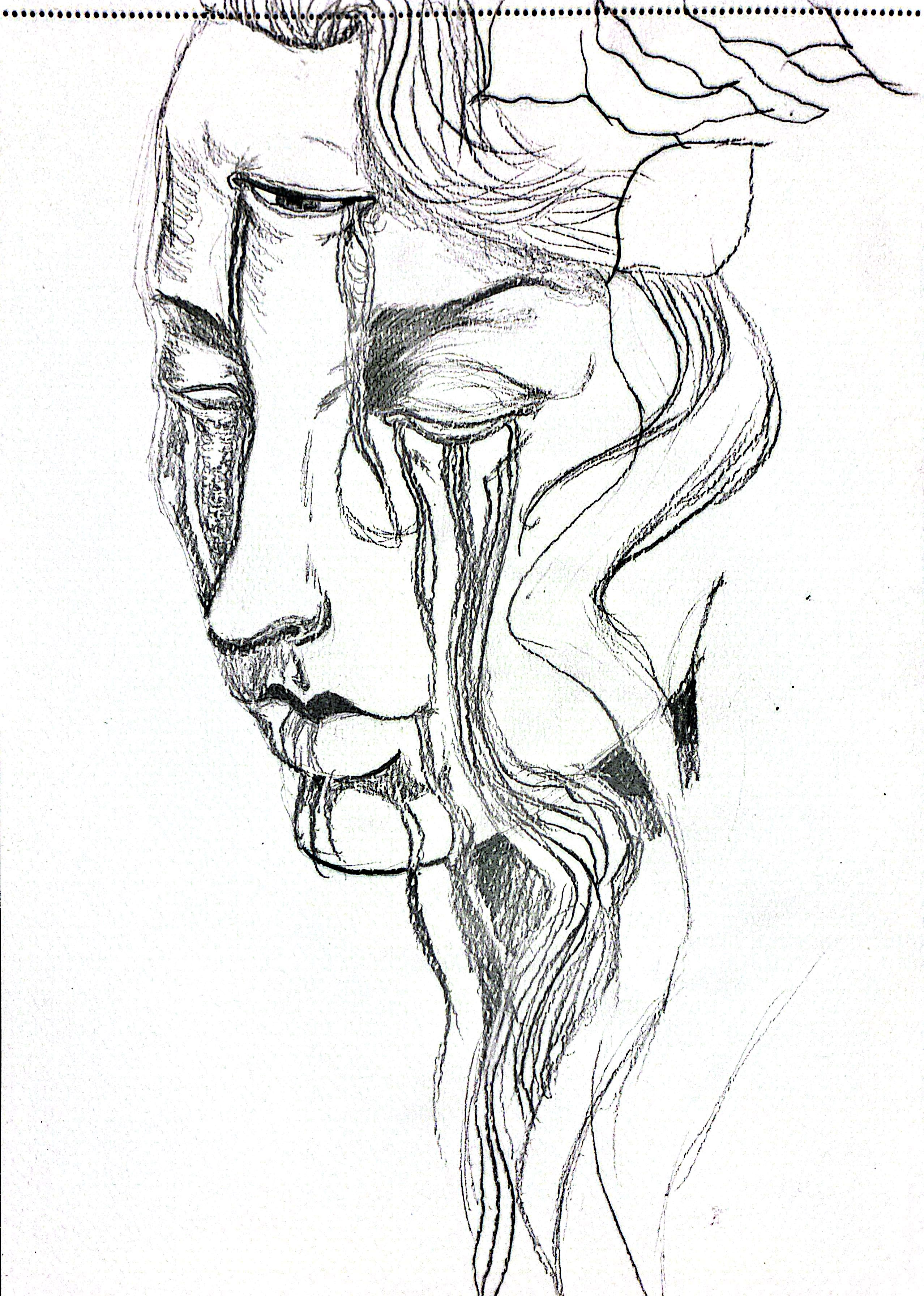
Unraveling
Graphite. Three weeping eyes, continuous flowing lines — grief without a name. Edition of 20.
Three eyes that weep in a single continuous line, each connected to the next without lifting the pen. Grief as a physical thread, unraveling from inside. The repetition of the motif makes it feel both relentless and somehow quiet.
Printmaking — Monotypes
Monotype is a one-of-a-kind printmaking process — a single pull from an inked plate, never exactly repeatable. These prints are open edition but each impression carries its own subtle variations.
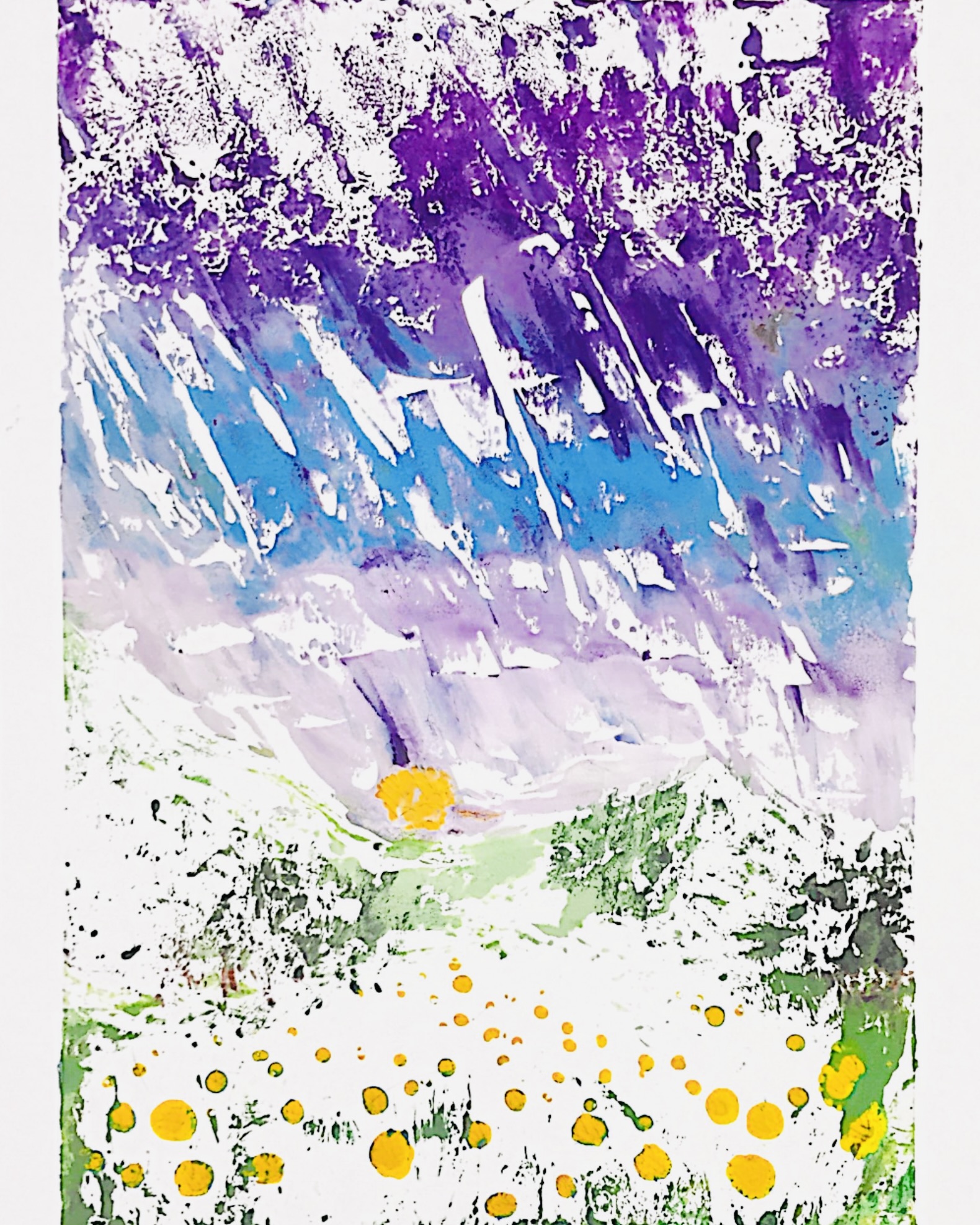
Rain: Monotype Print #1
Monotype on dry watercolor paper. Sharp-edged rain-like streaks and cut-out shapes. Open edition.
Printed on dry watercolor paper, the ink doesn't bleed or mix. The rough surface creates sharp edges around each shape, giving a cut-out feeling — more graphic and defined than the wet-paper version.
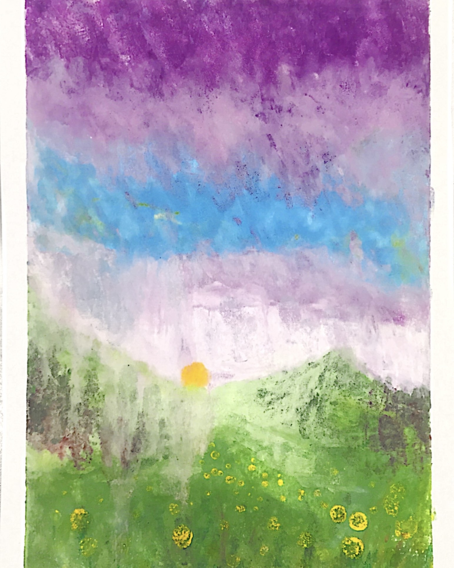
After Rain: Monotype Print #2
Monotype on wet watercolor paper. Saturated color bleeding into fiber — soft and atmospheric. Open edition.
The wet watercolor paper absorbed nearly all of the ink from the plate, resulting in rich, saturated color. Edges of the forms softened as pigments spread into the fibers — a dreamy, atmospheric effect that contrasts with the sharper dry-paper print.
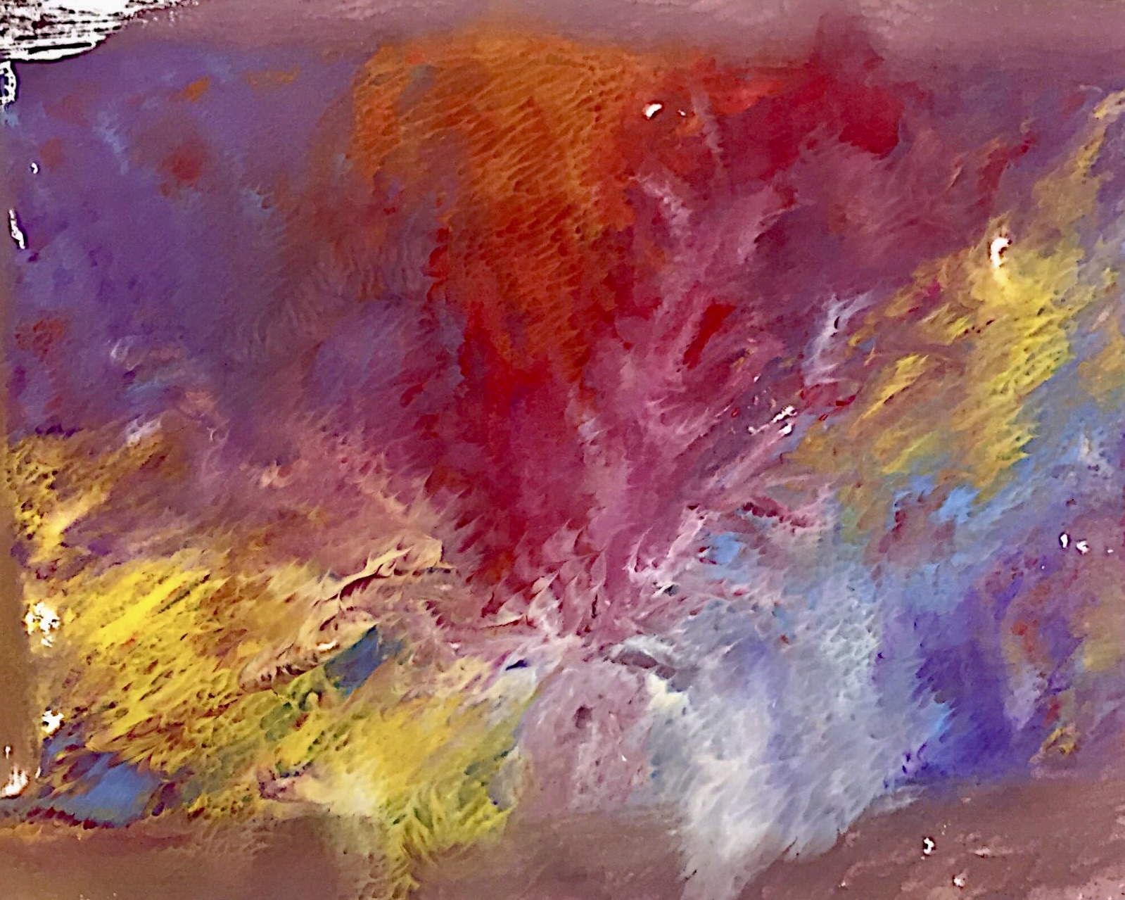
Freeform Monotype
Expressive monotype exploring color, gesture, and spontaneous marks. Open edition.
An experiment in letting go of detailed planning. Layered colors and loose brushstrokes on a smooth plate, transferred in a single pull. The result captures the energy of the process and the way chance shapes the final image.
2D Art Portfolio
My AP 2D Art Portfolio focuses on culture, community, and shared traditions — telling the story of making yaprak sarması through digital illustration, from gathering grape leaves to the final table. Open edition digital prints.
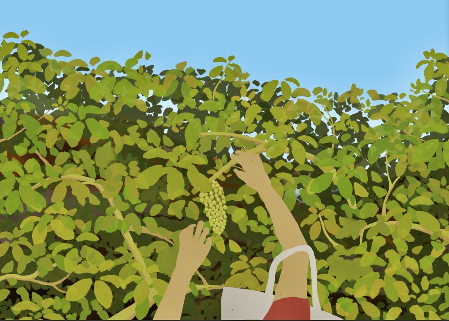
Reaching to the Grapes
Digital illustration. A joyful pause — reaching for grapes before the work begins. Open edition.
Before the leaves are gathered, the figure takes a moment to reach up and enjoy the grapes themselves. Bright colors and upward movement suggest growth and playfulness — traditions can be as rewarding in their small moments as in the final meal.
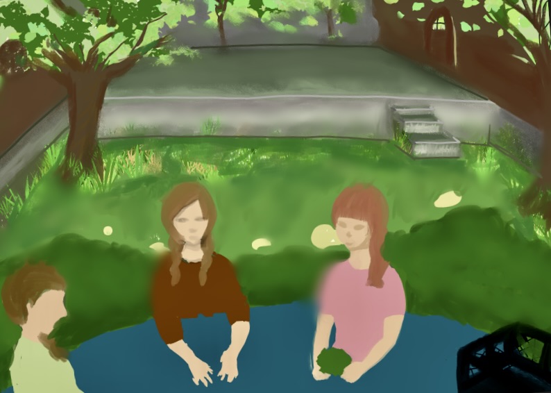
Women Gathered
Digital illustration. Turkish women stacking grape leaves — community and patience. Open edition.
Gathered around a cloth in the front yard to stack grape leaves from the garden — an activity I've taken part in from childhood. It is a reminder that traditions often begin outside, in nature, before they reach the kitchen table.
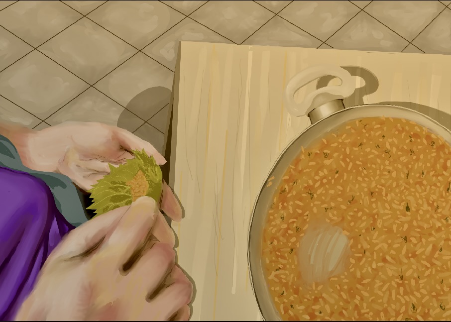
From My Mother's Hands
Digital illustration. My mom's practiced technique preparing yaprak sarması. Open edition.
Her way of rolling takes years of practice and expertise — quiet determination creating something meaningful with her hands. I felt it was important to showcase that skill and the deeper sense of purpose that comes from it.
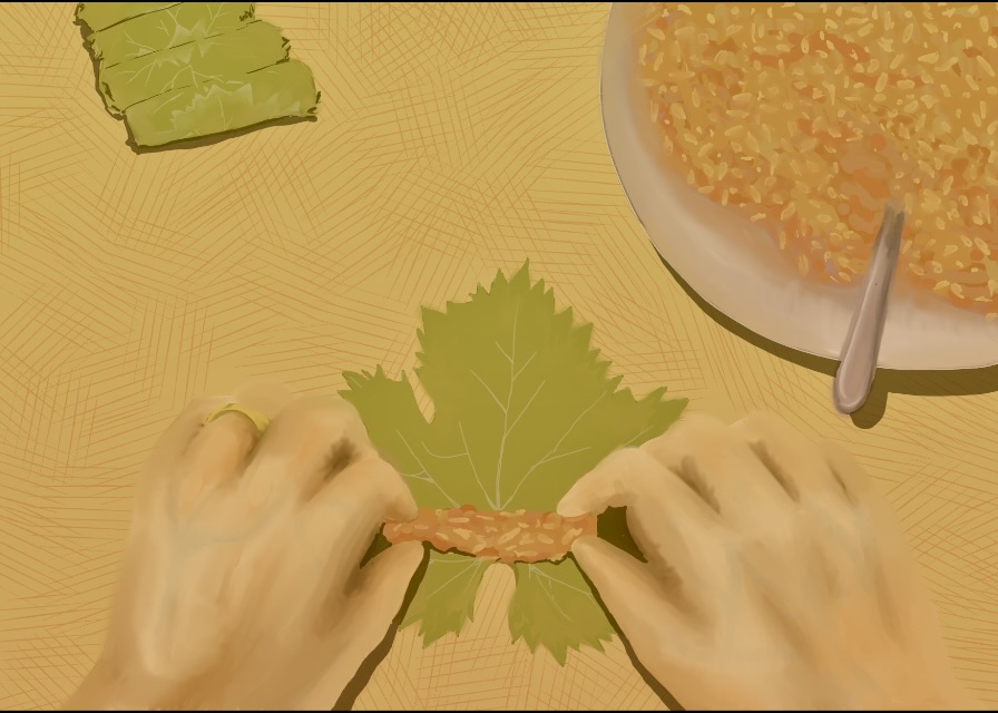
From My Hands
Digital illustration. A first-person view of rolling yaprak sarması. Open edition.
Rolling each sarma by hand — the step where the dish truly comes together. My own hands, framed to highlight the care taken in folding each leaf. My favorite dish, my favorite step.
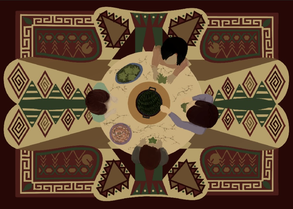
Imece
Digital illustration. Community work — hands, bowls, cooking as a collective act of care. Open edition.
In Turkish, imece means community work — people coming together to help each other. The arrangement of hands, bowls, and ingredients emphasizes cooperation and the warmth of working side by side, turning cooking into a collective act of care.
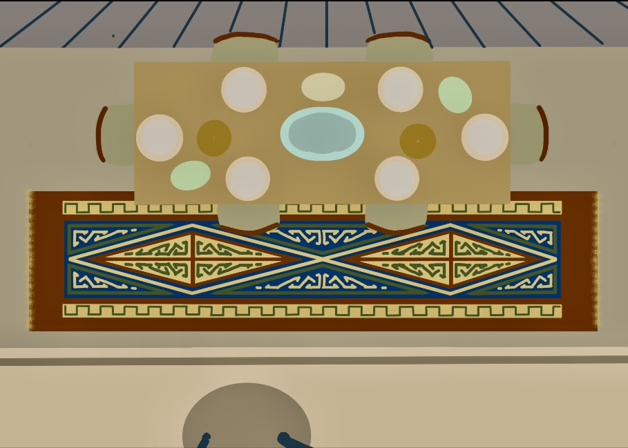
Setting the Table
Digital illustration. The final plate — outcome of community, time, and love. Open edition.
The result after all the steps and shared labor are complete. The presentation of the food, the arrangement of the plate — all emphasizing that this is more than a meal; it is the outcome of community, time, and love invested into the process.
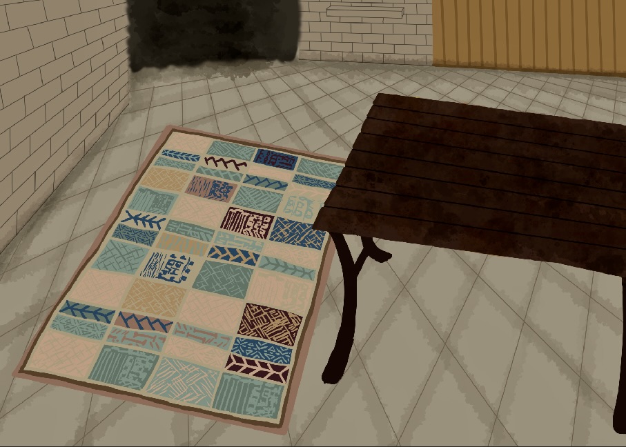
Carpet
Digital illustration. Modern Turkish carpet patterns — layered motifs and rich color. Open edition.
Repeating patterns, rich colors, and symbolic designs found in modern Turkish carpets. Layered motifs and textures echo traditional weaving while keeping a contemporary, graphic feel. Connecting the idea of home and culture to the surfaces we live with every day.
Poster Designs
Each poster translates a song from my playlist into a visual statement, one design principle at a time — movement, contrast, rhythm, white space. Open edition digital prints.
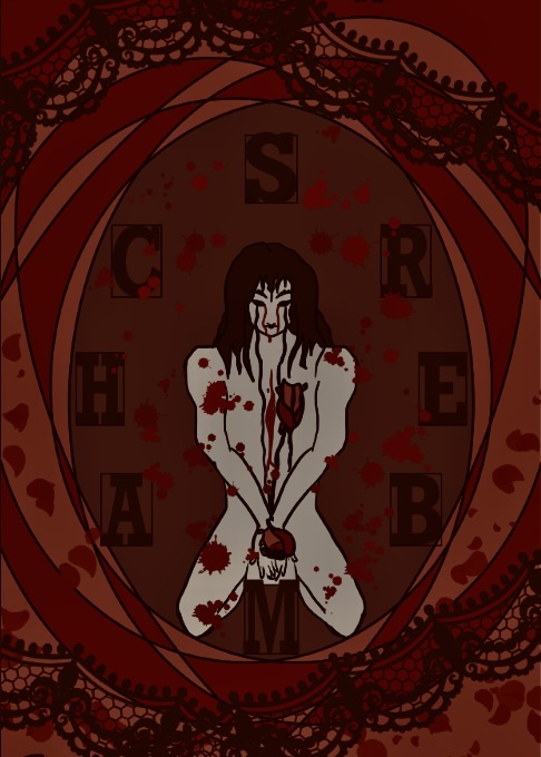
Chambers — Tamino
Poster design — Emphasis. The heart as a physical space; central focus, layered shapes. Open edition.
The heart imagined as both a physical space and an emotional chamber that traps memories and feelings. Strong central emphasis, a figure captured, limited color — reflecting the tension and vulnerability of the song. Listen
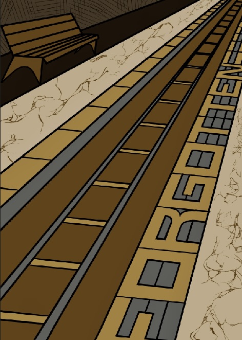
Forgotten — Aytekin Ataş
Poster design — Movement. Perspective lines echo the feeling of being carried forward. Open edition.
Perspective lines and dull colors show how memories drift, blur, and slip away. The motion mirrors the feeling of being carried forward while something important is left behind. Listen
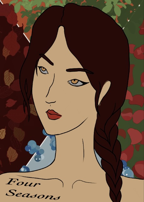
Four Seasons — Taeyeon
Poster design — Contrast. Four seasons, four emotional states, four shifting palettes. Open edition.
Divided into four sections to represent the times of year, with shifting palettes and shapes to echo themes of changing love and perspective. The visual contrast between sections reflects the emotional contrasts in the lyrics. Listen
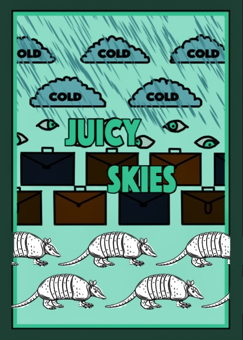
Juicy Skies — LAZY GHOST
Poster design — Repetition. Looping motifs and a bright dreamy palette. Open edition.
Repeating visual motifs mirror the looping, relaxed feeling of the song, drawn especially from its repetitive lyrics. Vibrant colors and playful composition capture a dreamy, surreal atmosphere — light and slightly mysterious. Listen
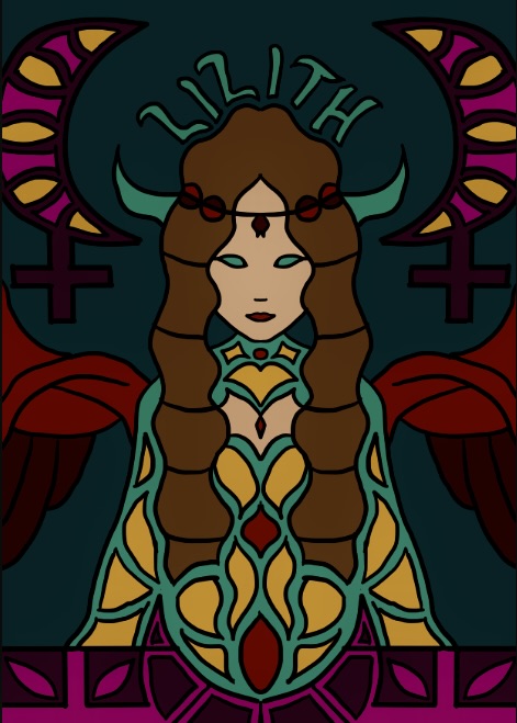
Lilith — Saint Avangeline
Poster design — Symmetrical Balance. Stained-glass Lilith; power, mystery, sacred femininity. Open edition.
Lilith as a central, iconic figure framed in stained-glass–like shapes, using mirrored forms and glowing color to express power, mystery, and sacred femininity. Symmetry gives calm structure while the details remain intense and emotionally charged. Listen
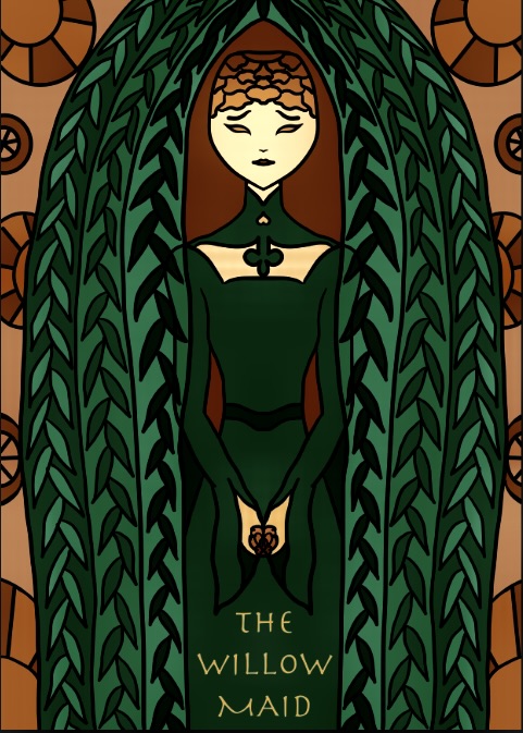
The Willow Maid — Erutan
Poster design — Pattern. Organic branching forms and stained-glass textures. Open edition.
Organic, branching shapes and stained-glass textures echo the natural setting and folk-like quality of the song. Repeating forms suggest both tangled roots and protective branches, wrapping the central figure in a quiet, enchanted atmosphere. Listen
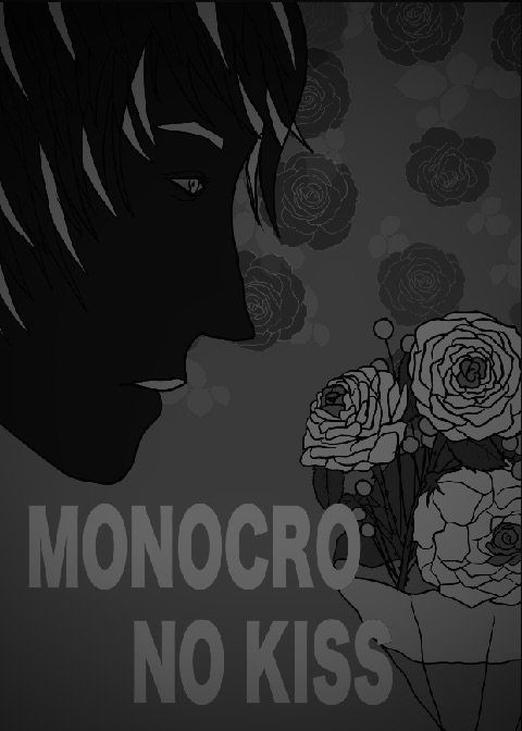
Monocro No Kiss — SID
Poster design — Hierarchy. Floral shapes, layered type, a monochrome directional portrait. Open edition.
Floral shapes, layered type, and a strong directional profile guide the viewer's eye from the main focal point to supporting details. Monochrome palette and structured layout reflect the tension and drama in the music. Listen
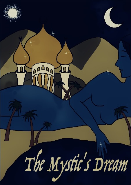
The Mystic's Dream — Loreena McKennitt
Poster design — Proportion. Oversized mythic figure in a desert landscape. Open edition.
A giant female figure within a natural desert setting — an unusual scale relationship suggesting she is part of something larger and timeless, like a dream or a legend. Listen
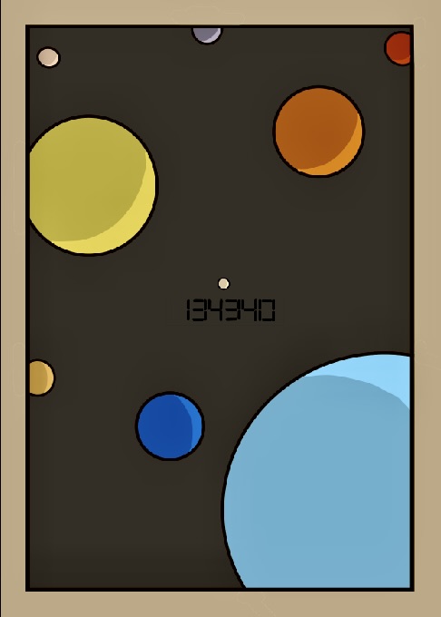
134340 — BTS
Poster design — White Space. Minimal, silent, about distance and reclassification. Open edition.
Large empty areas speak for feelings of isolation — Pluto renamed as asteroid 134340, an analogy for the names we give to past relationships we distance ourselves from. The minimal layout suggests silence, distance, and a quiet search for place and meaning. Listen
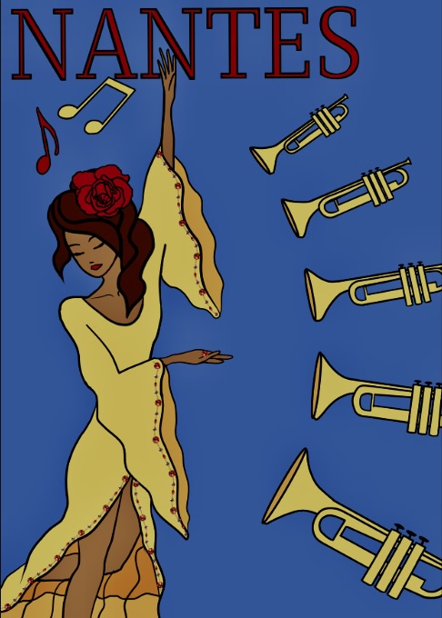
Nantes — Beirut
Poster design — Rhythm. Trumpets, layered lines, a visual beat through the city. Open edition.
Repeating shapes of trumpets, layered lines, and a bright color palette create a visual beat that moves the eye around the composition. The song's blend of melancholy and liveliness — as if the music is weaving through a city as the woman dances. Listen
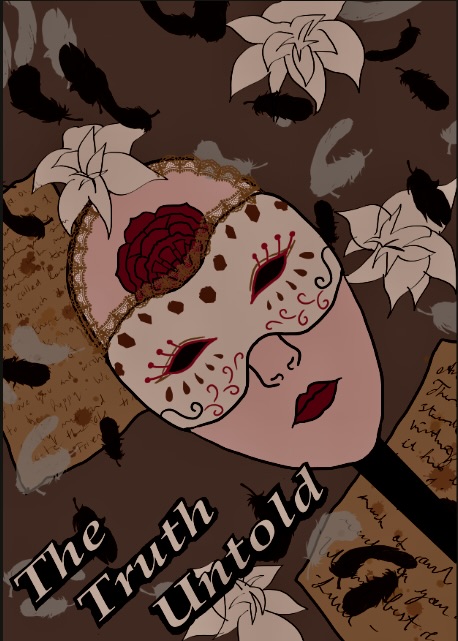
The Truth Untold — BTS
Poster design — Unity. Overlapping shapes, feelings hidden behind a mask. Open edition.
Color transitions and overlapping shapes show how separate pieces come together to form a whole. Reflects the emotional honesty of the song and the idea of feelings and self we hide, afraid of rejection. Listen

Wolven Storm — Marcin Przybyłowicz
Poster design — Variety. Medieval imagery, a fox at lavender fields, dramatic storytelling. Open edition.
Different visual elements (figures, colors, text blocks) unified through strong alignment and framing. Medieval-inspired imagery of a fox at a lavender field combined with contemporary graphic structure reflects the song's storytelling roots and dramatic tone. Listen