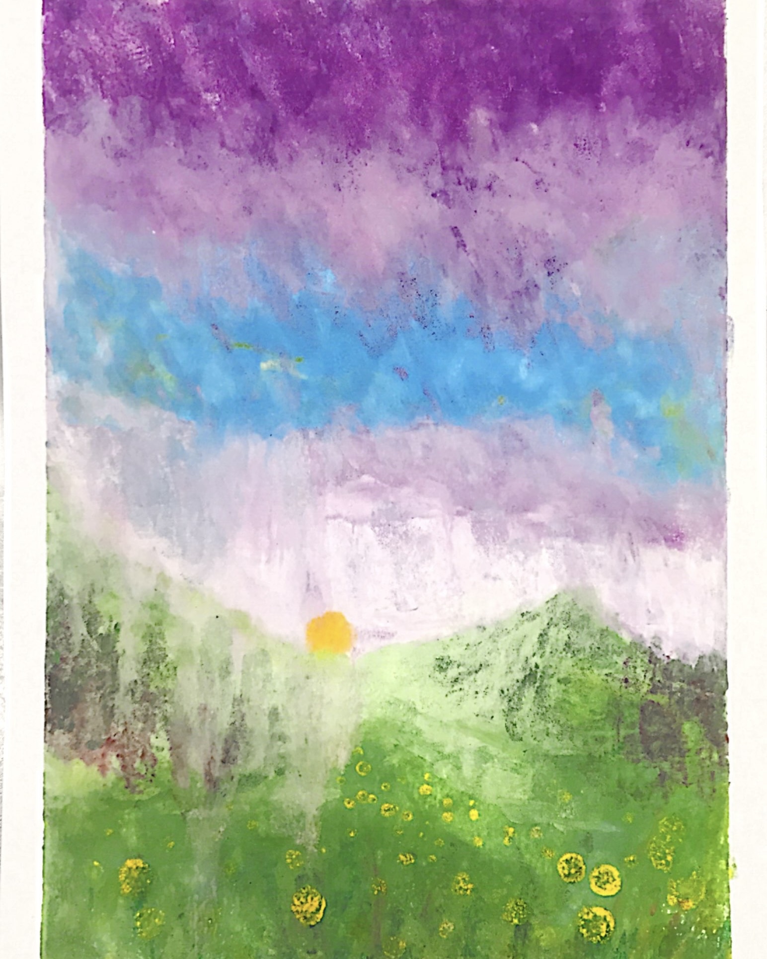
Graphic Design & Digital Art
Design is where I first learned to make things say something. My AP portfolio was built around Turkish food traditions, figuring out how to translate culture into composition, color, and type. These works are studies in how much a single visual choice carries: the shape of a letterform, the temperature of a palette, the weight of a line.
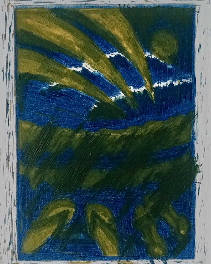
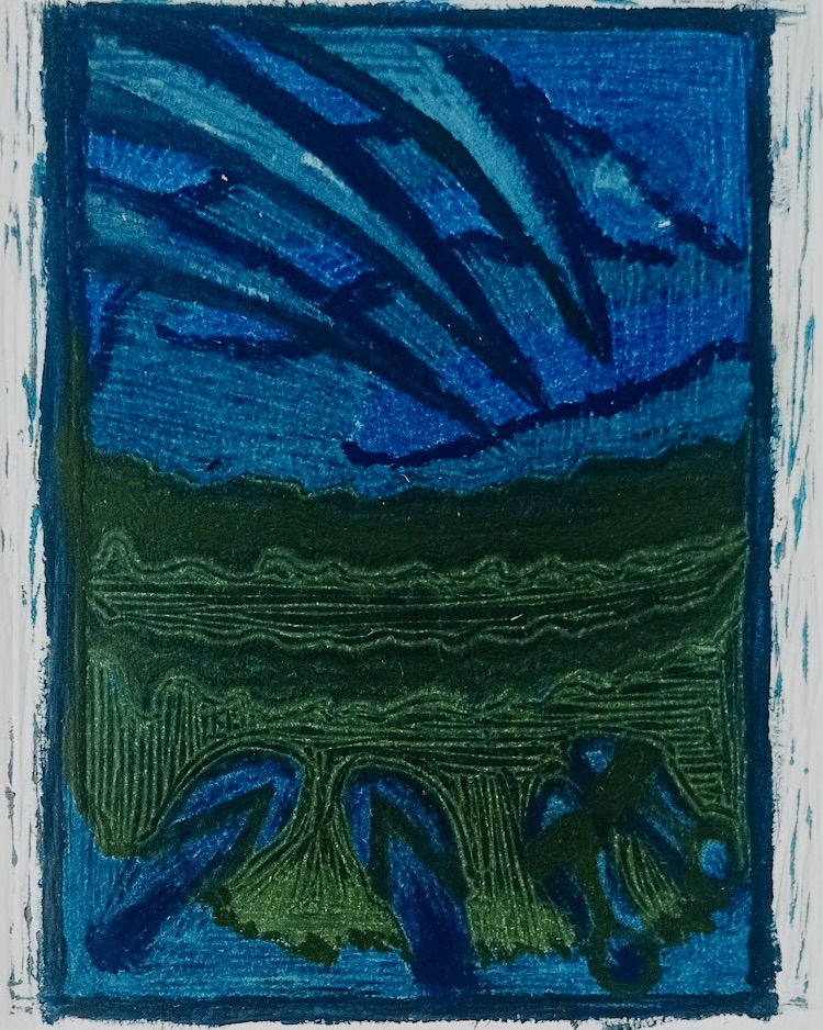
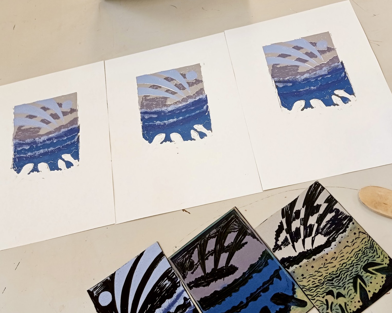
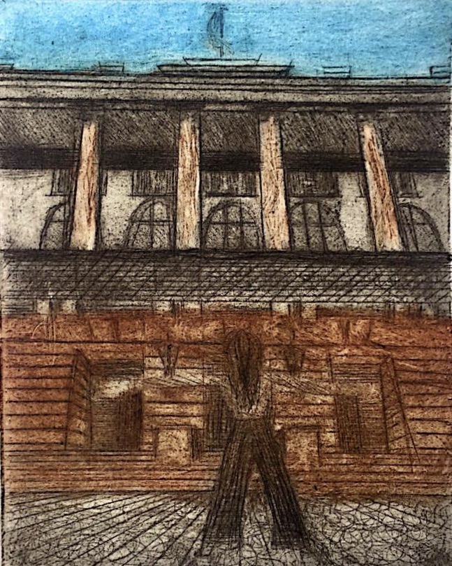
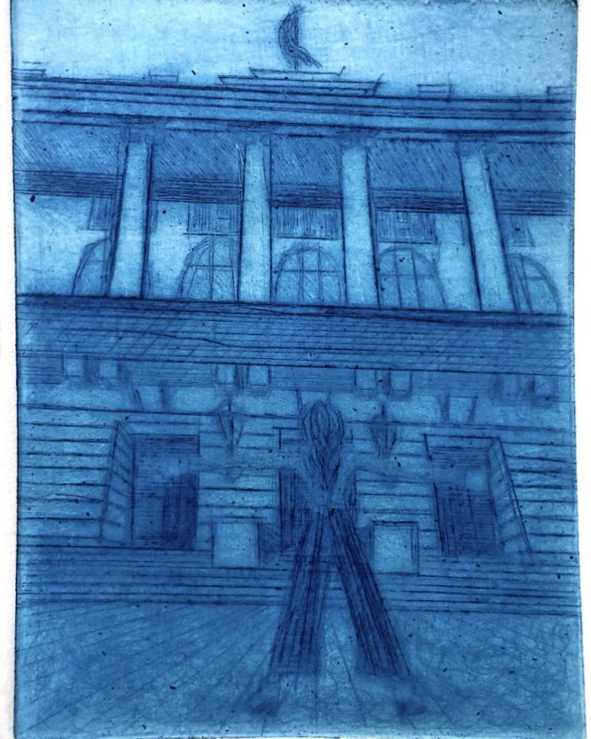
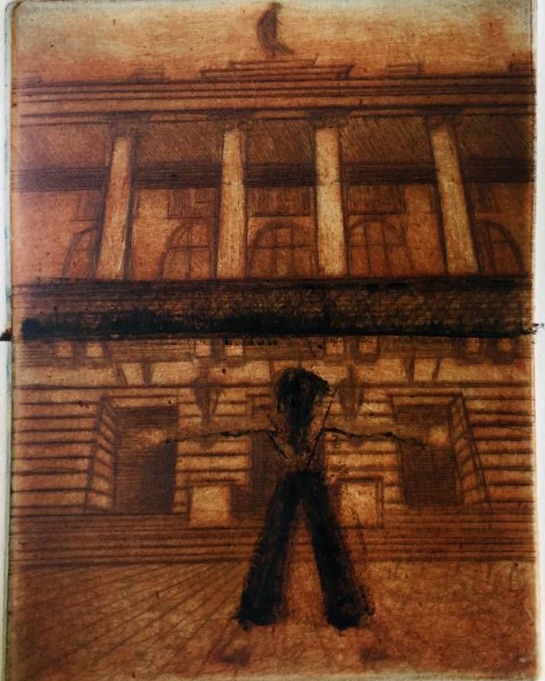
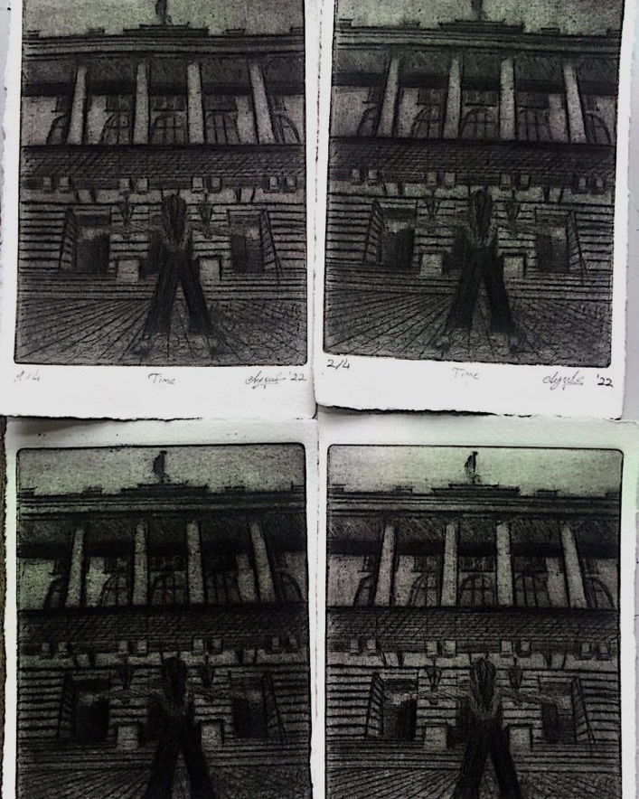
Print Making
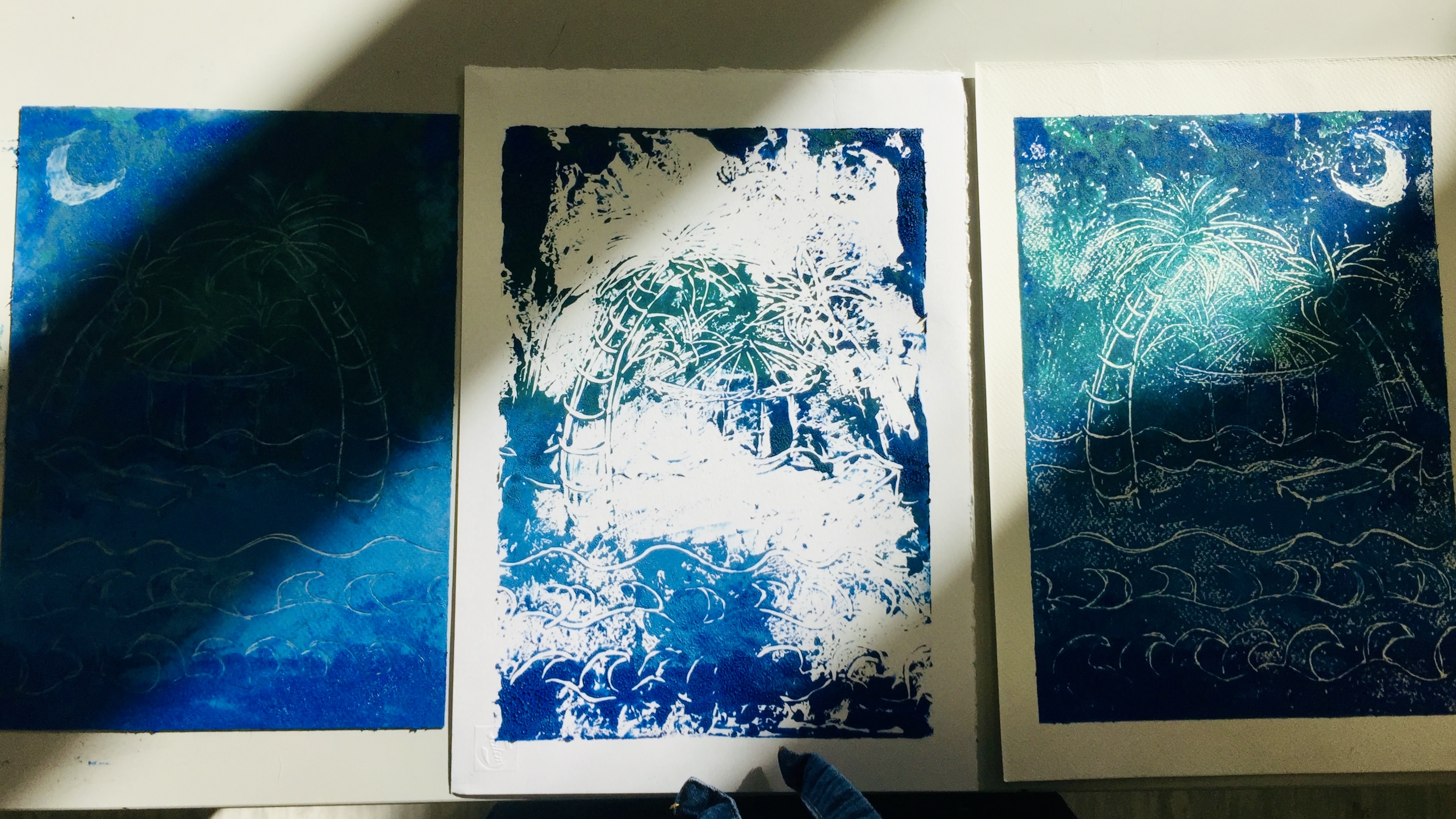
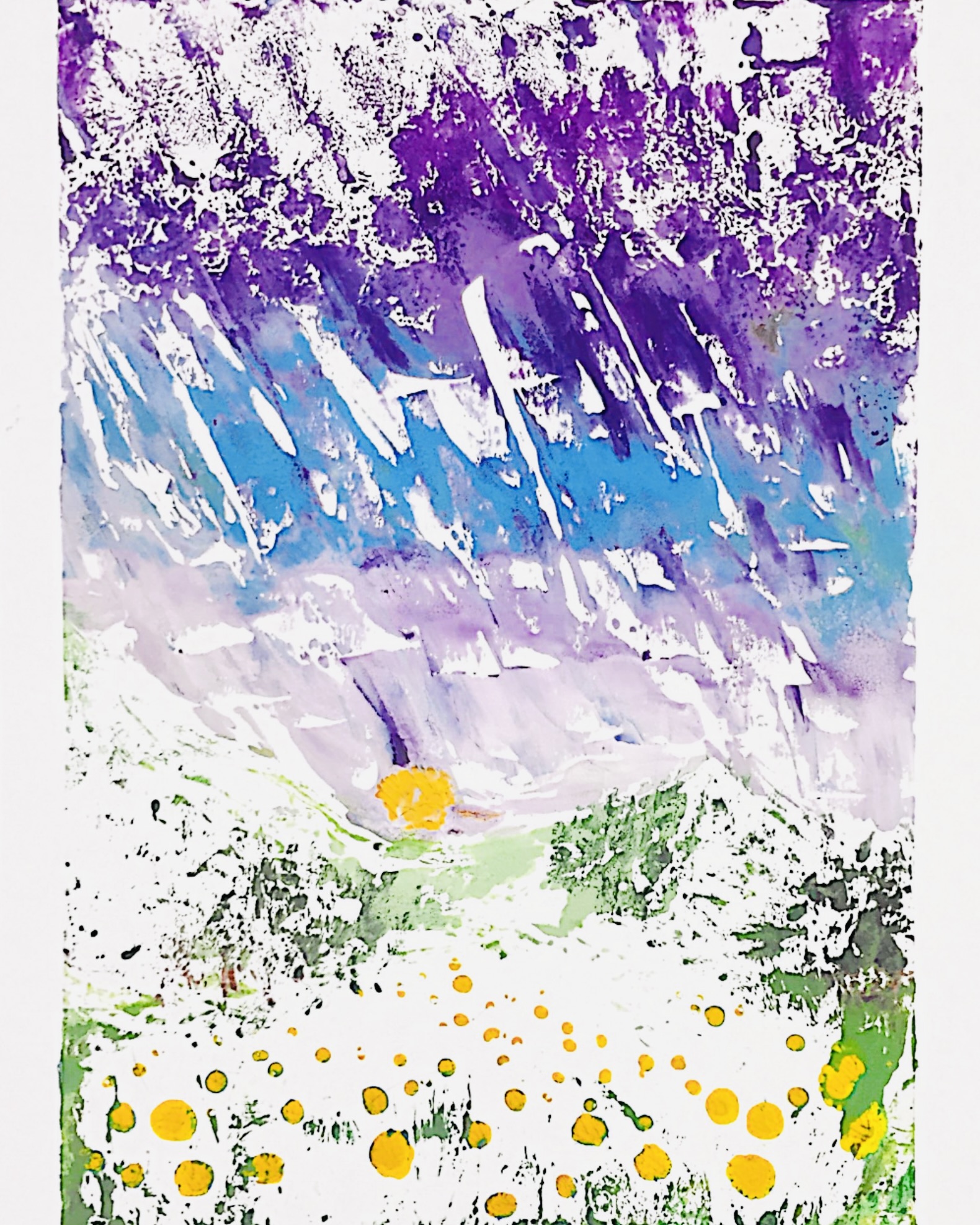
Printmaking lets me combine careful planning with happy accidents. Through techniques like linocut, intaglio, and monotype, I explored how carved lines, etched plates, and ink on glass plates can all create very different moods. Each print teaches me something new about texture, contrast, and repetition, and how a single image can change when it is printed again and again on different papers or with different inks.
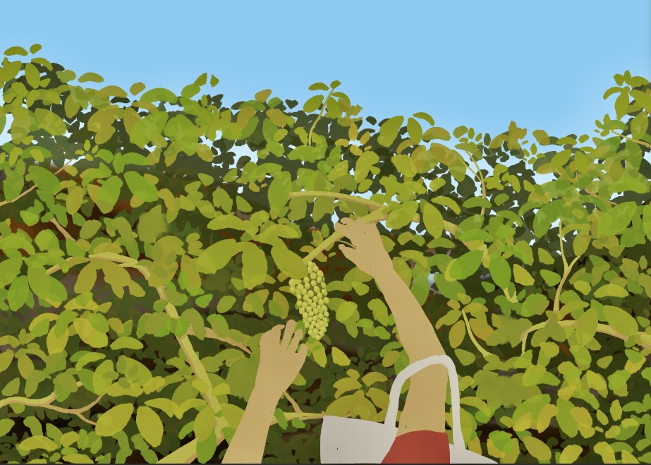
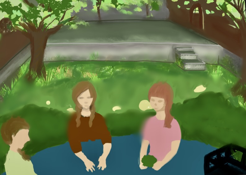
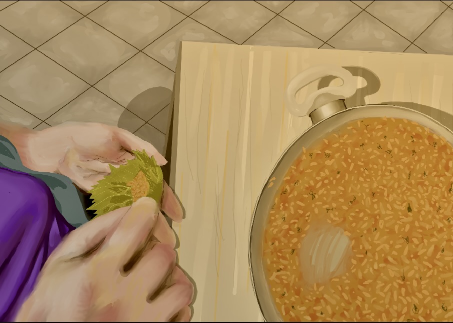
2D Art Portfolio
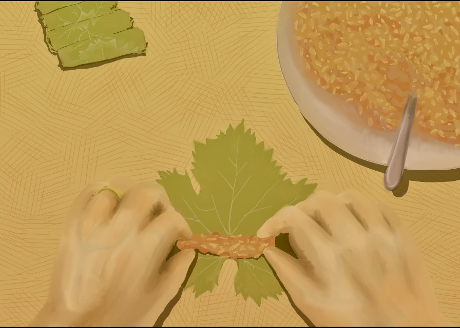
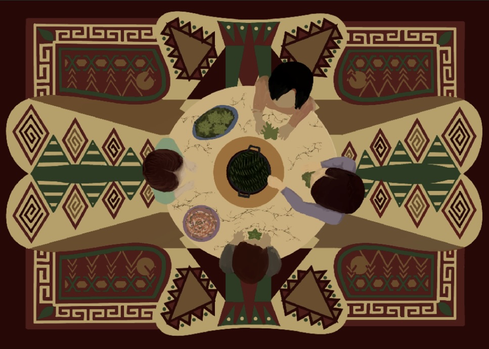
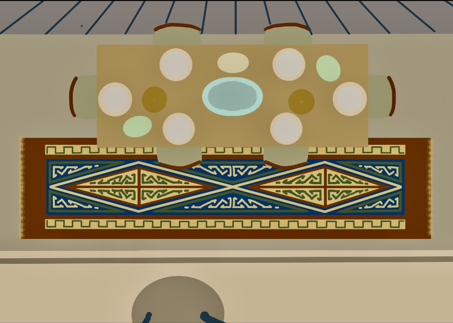
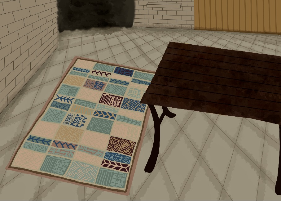
My AP 2D Art Portfolio focuses on culture, community, and shared traditions. I chose to tell the story of making yaprak sarması (stuffed grape leaves), a dish that reminds me of family, home, and people working together. Through digital illustration, I followed the process step by step, from gathering the leaves to the final plate of food, while also weaving in visual references to Turkish textiles, village life, and everyday rituals.
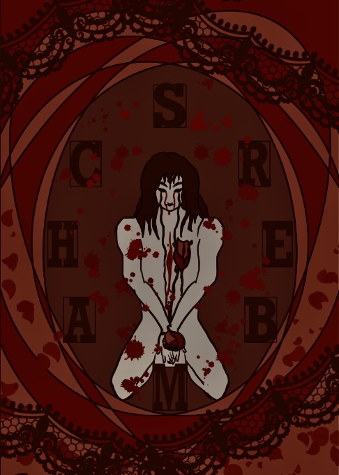
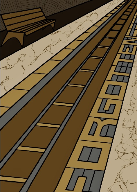
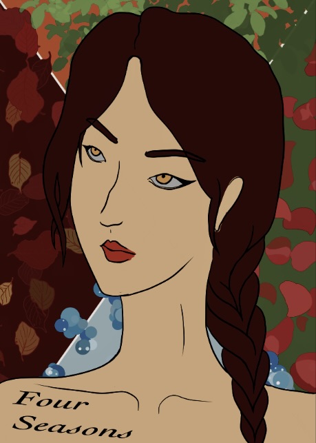
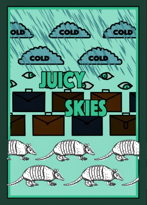
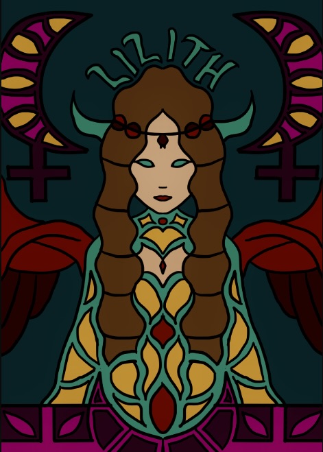
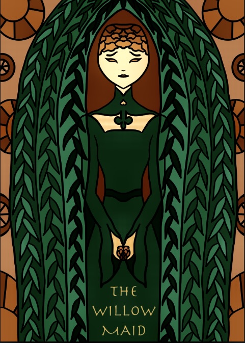
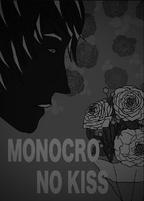
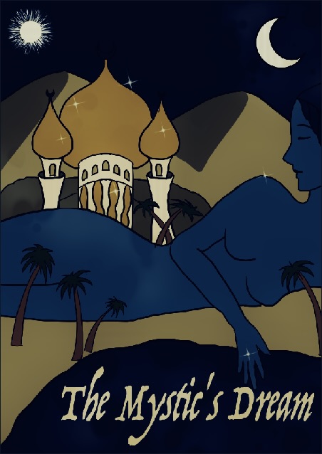
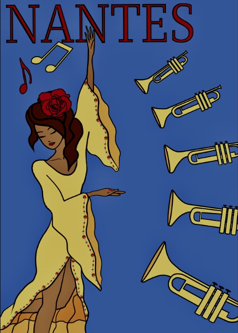
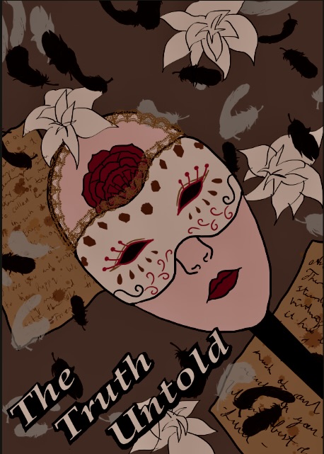
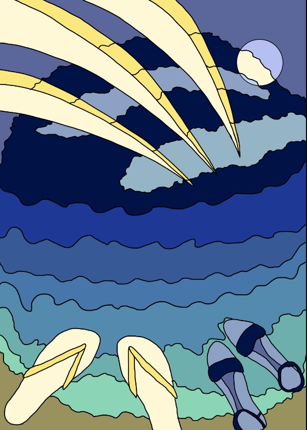
Poster Designs
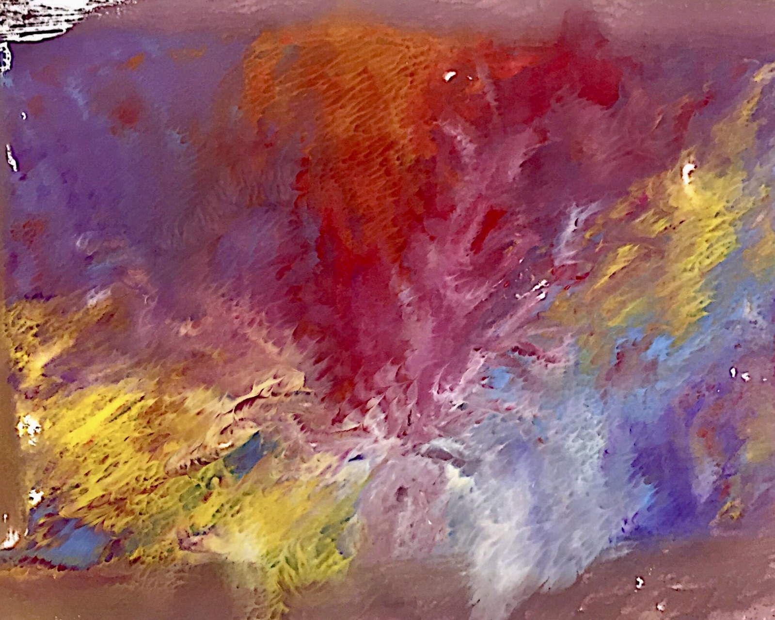
This series of posters brings together design principles and music. Each piece is inspired by a specific song from my playlist and focuses on one core principle, such as movement, contrast, rhythm, or white space. I listened closely to the lyrics, mood, and instrumentation, then used color, typography, and composition to visually translate how the song feels.